+1
Alexander Blach (Developer) 13 years ago
Actually, the icon was created by the guys from Softfacade (http://softfacade.com/) who are well-known as one of the best icon designers in the world...


+3
Alexander Blach (Developer) 13 years ago
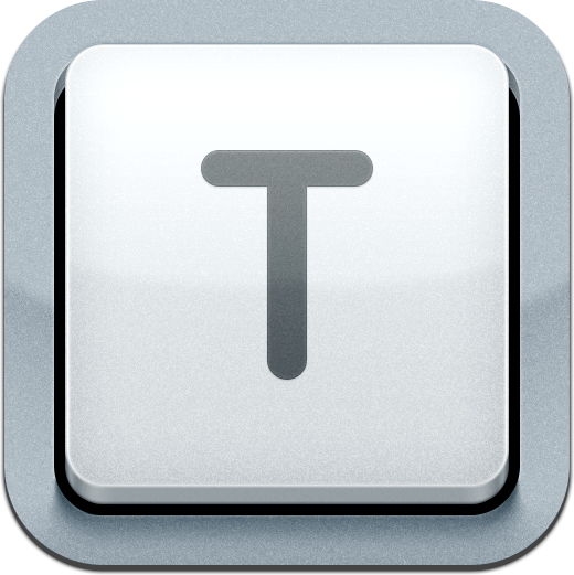
Here is the full version (512x512). I can assure you that it was a lot of work - I've seen the amount of layers in the Photoshop file :)


+3
Amazing Vanish 13 years ago
Pshaw! The icon is very professional. It looks like a physical representation of a T key form the soft keyboard and is representative of the app's function. Don't change it into yet another document with pen cliché piece. If you like it, and only one person doesn't, then there's nothing to see here. Move along. :)

0
Alexander Blach (Developer) 13 years ago
Thank you :)

0
kjtriplett 13 years ago
Yeah, this icon is very professional looking. It's beautifully done. Please don't change it.

0
John Holllis 13 years ago
Oops, better drop that one as I seem to be the only one who does not get the monochrome thing. The app is fantasttic , thank you.

+1
Jan Rychter 13 years ago
I think the problem is that when you scale the icon down, the key metaphor gets lost. I also thought it didn't look too well and I never realized it was supposed to represent a key until I saw the 512x512 version.
Customer support service by UserEcho

